This exercise uses a kaggle dataset from an Ecuadorian-based grocery retailer, Corporación Favorita, accessed here. At this point, I already cleaned and pre-processed the data (converting datatypes, resolving nulls, merging csv files, etc.).
The purpose of this exercise was to answer questions with this dataset using both pandas queries & visualizations with matplotlib or the seaborn packages.
This was mostly done to practice with the seaborne package since I wanted to get faster at making graphs during my exploratory data analysis process.
There’s redundancy in my plotting code (repeated formatting and import calls) but this was intentional, as I wanted each code block to be a snapshot. That way, if I wanted to recreate the plot, I would be able to do so just by following along my notes here. If I were implementing this in a real use case, I would turn my plots into a function that had global formatting to reduce the repeated chunks of code.
Each question has an image of my code for the pandas query, a plot, and then an image of the code I used to make the plot. My reflections for this exercise are at the end of this post.
I used jupyter notebooks in VSCode for these exercises.
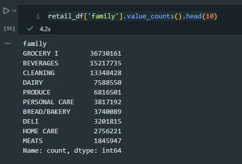
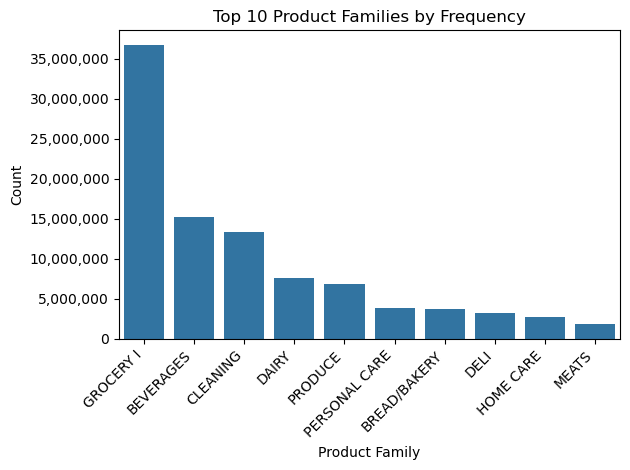
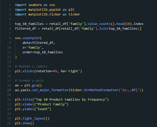
Question 1: which product families appear most often in the retail dataset? (Frequency)
pandas query
plot
code to generate the plot
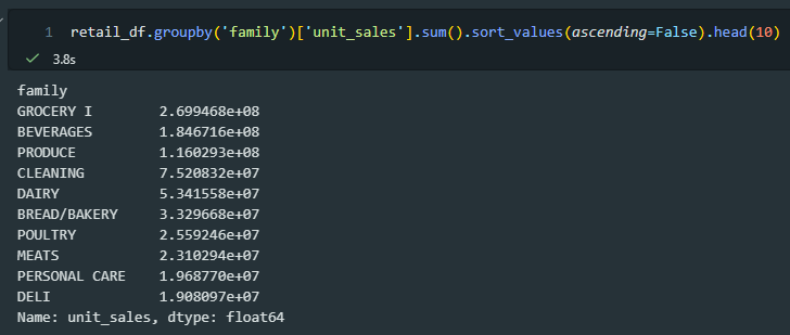
Question 2: which product categories generated the most unit sales (top 10)?
pandas query
plot
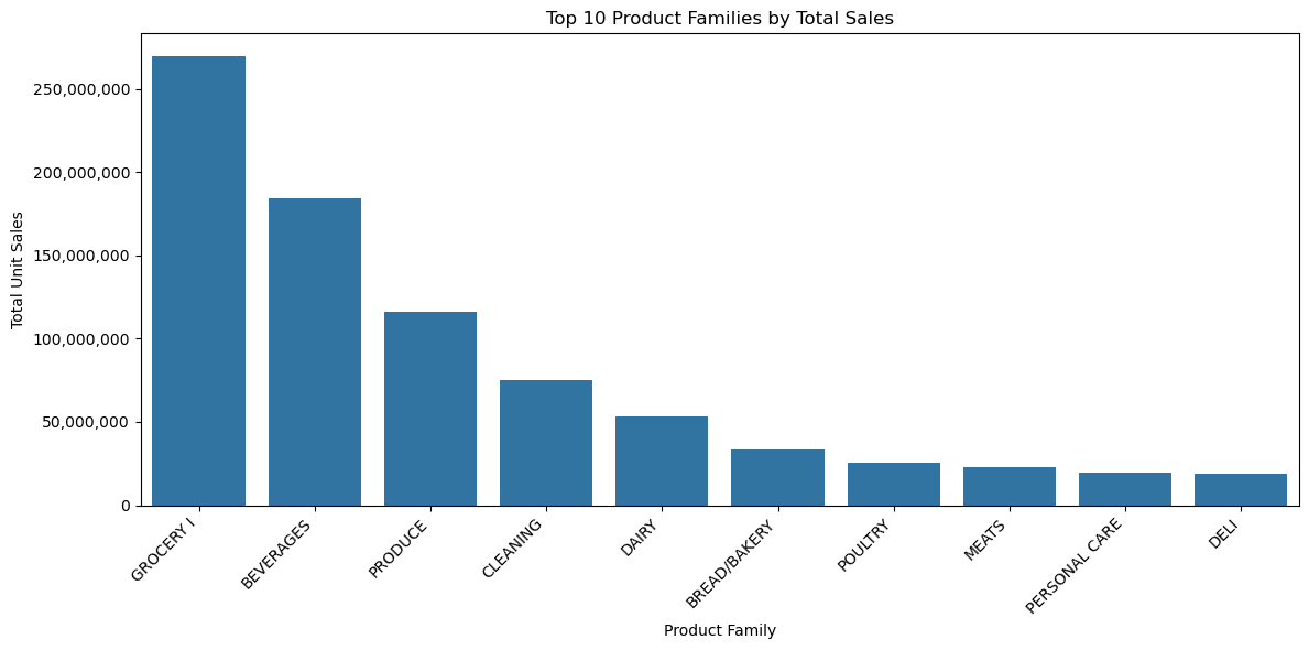
code to generate the plot
Overall reflections
- plots and visualizations can be more effective at quickly communicating information
- the plots revealed more data cleaning was needed and helped me identify which ideas needed more queries and investigation
- plots take me more time to build and involve troubleshooting with layout & consulting seaborn documentation
- python is very efficient with queries for large datasets; running these in excel with macros would have taken a much longer time
