When working on data analysis projects, there are a few things I do each time to get a sense of the data that I’m working wtih. One of those things is plotting.
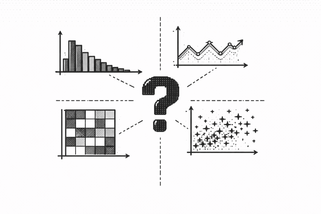
Before I plot something, I ask myself these questions to make sure the plot I’m using will help me get the answer I want. This table also summarizes some of the most common plots I use and gives some examples of when I use them.
| Question(s) | Plot Type | When to Use |
|---|---|---|
| What is the distribution of the data? (Are there outliers or skew, does it differ across groups?) | Histogram / Kernel Density Estimate (KDE) / Boxplot / Violin | Histogram / KDE = shape Boxplot = summary & outliers Violin = shape & group comparison |
| How does something change over time? | Line plot | Looking at trends (but always aggregate first: daily, weekly, etc.) |
| How do categories compare (value)? | Bar plot (aggregated) | Compare totals or averages (e.g., sales by product family) |
| How frequent are categories? | Count plot | Counts of occurrences (frequency) |
| How do variables relate? | Scatter plot / Pairplot / Heatmap | Scatter = 2 variables Pairplot = multi-variable exploration Heatmap = visualizes corr. coefficients |
